Securisico Website
Overview
PT. Risco Cita Sinergi aims to introduce its product, Securisico, to potential customers. This project primarily involves designing a website to provide information about Securisico and offer insights into risk management and control.
My contribution
UX Mapping UI design
The team
1 × product manager 1 x Bussines 1 × product designer 1 × engineers
Year
2020

Process

Interviews with client & stakeholder
With the aim of acquiring comprehensive information for prospective Securisico users, I conducted interviews with the client and stakeholders. The objective was to grasp both the desires and needs of the users.
Define
After obtaining information from the client and stakeholders, the established goals for the website include:
• Brand Identity: The website's color palette should align with their brand logo.
• Font Style: A modern and clean font style is desired to impart a contemporary feel.
• Casual yet Professional: The website should maintain a balance between a casual and professional aesthetic.
Exploring Ideas
Color Requirement

I established the color requirements by referencing their logo, "Securisico":
• The main color is designated for the Call-to-Action (CTA) buttons, illustrations, and ornaments.
• The secondary color is applied to the screen-based elements and overall layout.
• The tertiary color is reserved for the headers and descriptive text.
Font Style

To uphold a modern and clean aesthetic for the website, I curated various font options, including both Serif and Sans Serif types. I presented several suggestions to the client, such as Helvetica Neue, Noto Serif, Ubuntu, and Montserrat. Ultimately, the client opted for the font Montserrat.
Create Information architecture for the website
To initiate the design process, I developed the website's architecture.

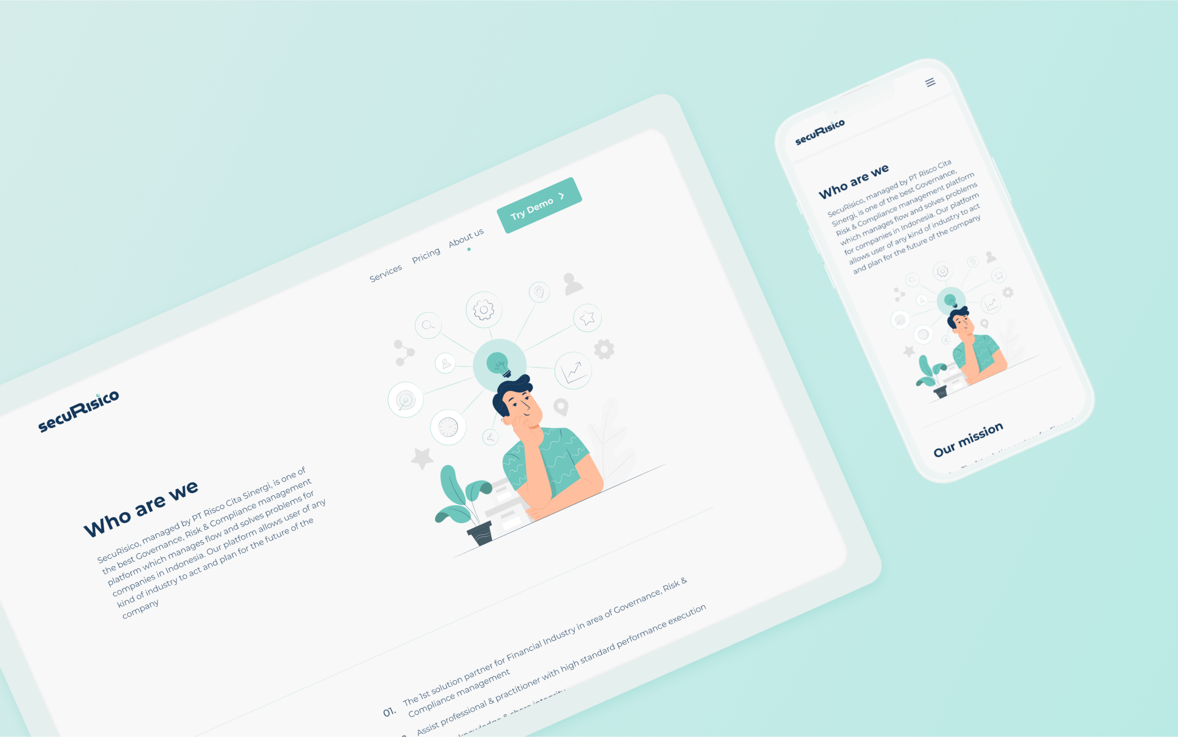
Final Design
Following the architectural planning, I proceeded to create a mockup aligned with the defined process. Here is the final design for the Securisico website.